Designing a simpler sign up flow for volunteer sign up and requests for weekly meals
THE BRIEF
For the final challenge in the Google UI/UX certificate course, I needed to design for social good and wanted to build on the UX knowledge I’d gained. I had been volunteering at a local kitchen that provides family meals weekly, no questions asked. While signing up as a volunteer myself and learning about the organization, I identified areas that could be improved on the volunteer sign up and meal request.
GOALS
Integrate all sign ups to be within the site and not using outside tools
Ensure all pages of the site would easily load, even with poor internet access. Especially the meal request page.
Make it easier to understand each type of sign up opportunity at a glance
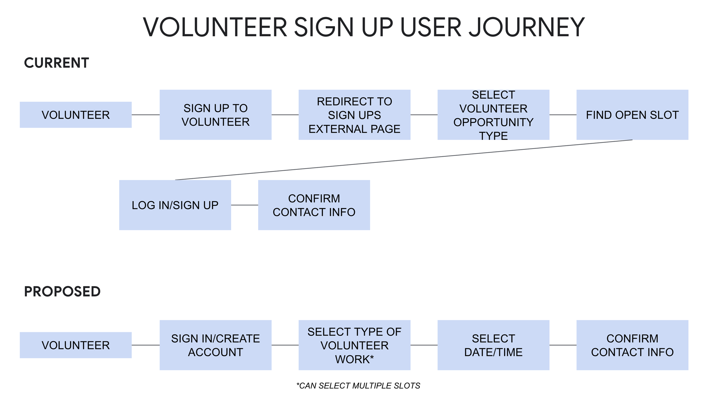
Decrease barriers to signing up for multiple volunteer days at one time; on current volunteer sign up, it’s not easy to see available or unavailable slots upon first landing on the sign up
For context, the current website can be viewed here
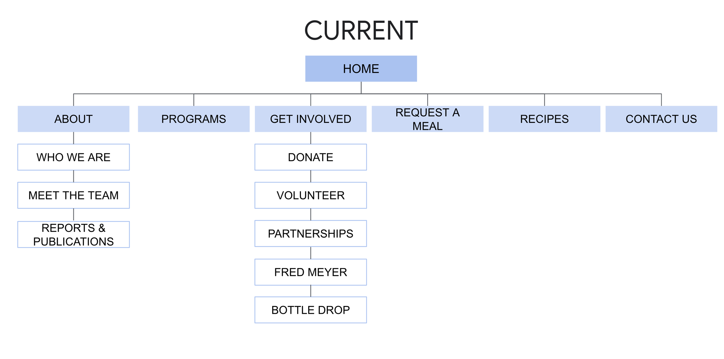
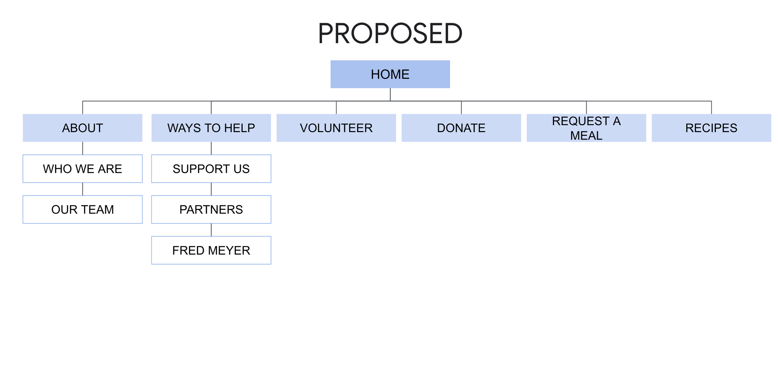
INFORMATION ARCHITECTURE
Initially I explored simplifying the overall site IA since I wanted to have the volunteer sign up integrated within rather than being through an external sign up.
VOLUNTEER USER JOURNEY
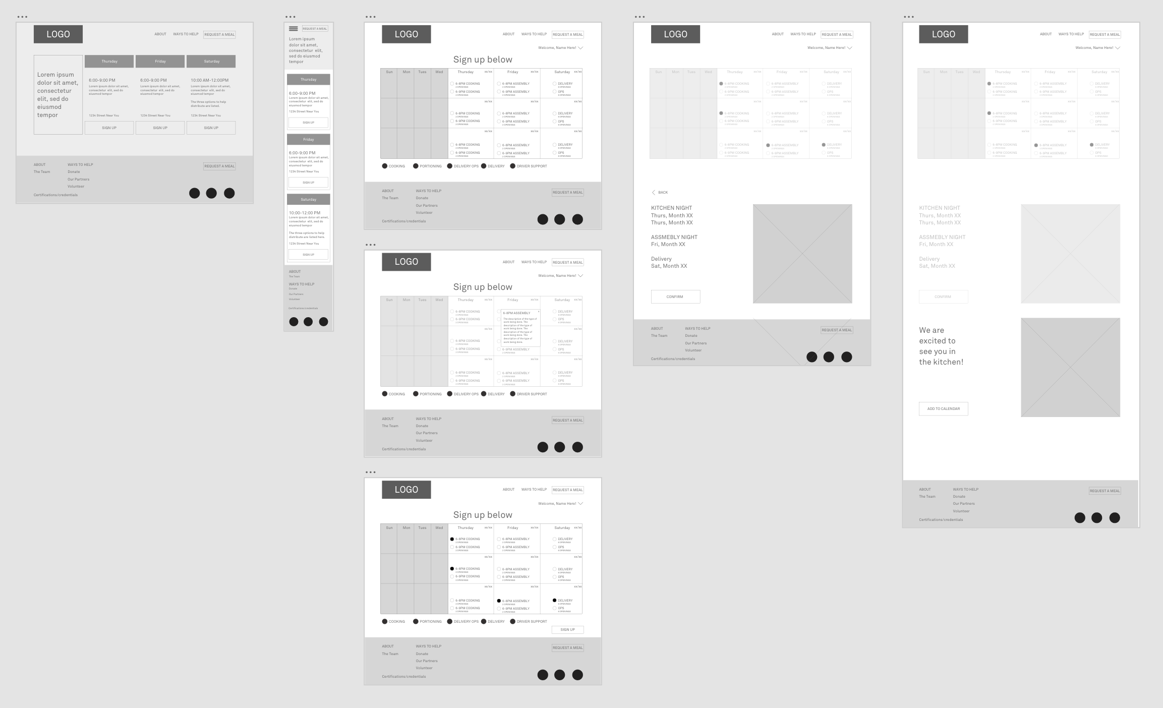
The current volunteer sign up journey required many clicks to complete the sign up and opportunities for the potential volunteer to fall off the journey. For the new wireframes and user journey, my goal was to simplify the journey and allow the volunteer to sign up for multiple opportunities in one session. After speaking with other volunteers, I know many prioritize signing up for the same volunteer opportunity for several weeks in the future at one time. Also based on these conversations, I recognized that a calendar view would be an important feature.
WIREFRAMES
Below are a sample of wireframes while I explored ways to improve the overall site map and specifically, volunteer sign up flow.
MEAL REQUEST FORM
I designed the meal request form to be minimal and quick loading. If the user doesn’t have access to data or wifi, I would also like for it to be able to quickly load and not be bogged down with images or extra animations. The menu board hero space is live text so it would be translated into the user’s preferred language, as well as the form below. Ideally the form could also be updated in the back end to collect any additional information needed.
Volunteer sign up
Through wireframe iterations, I landed on this flow of information. I utilized color coding the calendar to represent the different days in the kitchen at a glance. If a day has all volunteers, it would gray out and be unclickable. It is easy to sign up or remove volunteer opportunities in a few taps. It also makes it simple to sign up a friend to come with you!
I considered both first time and returning volunteers in the flow. For first time, it is easy to gain more information and learn about each day in the kitchen; however, if you are returning, you can by-pass this and quick add each open volunteer opportunity.