
GoodReads

Modernizing Goodreads for better data gathering and organized library shelves.
After hearing user pain points of the app not functioning to meet their goals of keeping their libraries organized, I made a case study to address the following pain points.
The Problem
While at a bookstore with friends using the GoodReads app we discussed several frustrations, but we all continued to use it so I decided to imagine a new version that would be truly loved.
Search function doesn’t always populate the right book
The ‘shelf’ feature doesn’t function as users hope. Users would prefer it to function the same was as the Want to and Read existing shelves. There is a desire for more custom organization
More detailed rating system including half stars and did not finish
Research
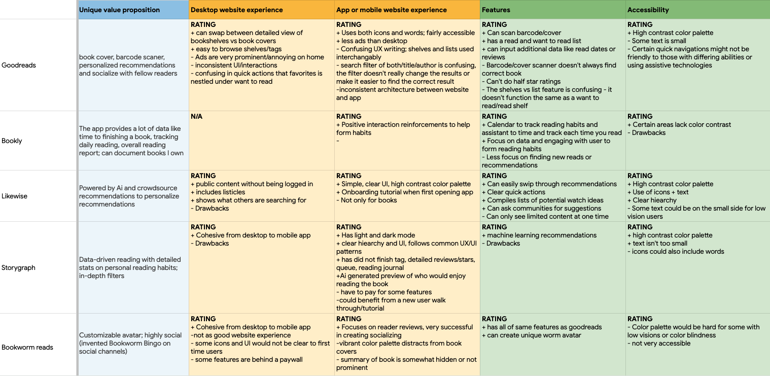
For research, I started with a competitive analysis. I reviewed similar apps for reading/tv watching/movies and narrowed down to deeply researching Bookly, Likewise, Storygraph, and Bookworm Reads.
Key takeaways:
Likewise is uniquely positioned to document and make recommendations for books, movies, and tv, utilizing Ai to make personalized recommendations. Also had the most accessible experience following normalized design patterns
Bookly and Storygraph lean into data and personalized tracking
Bookworm Reads is a highly social and trendy app leaning into connecting through reading
Wireframes
In the paper wireframing phase, I used information I’d gathered from talking with users to improve user flows. I spent time exploring different potential navigation options and landed on a simplified 3-option bottom nav. I also explored home screen iterations after identifying that what is most important to users is: where I’m currently at in my books, finding new recommendations and quickly recalling a book they’ve previously read.
Testing & Feedback THEMES
Like the current progress card but would like to be able to adjust specific page count
Nice to have option to toggle between hours left to read or pages left
The covers of the books change slightly in size and it’s confusing and distracting
High-Fidelity Mock-Ups
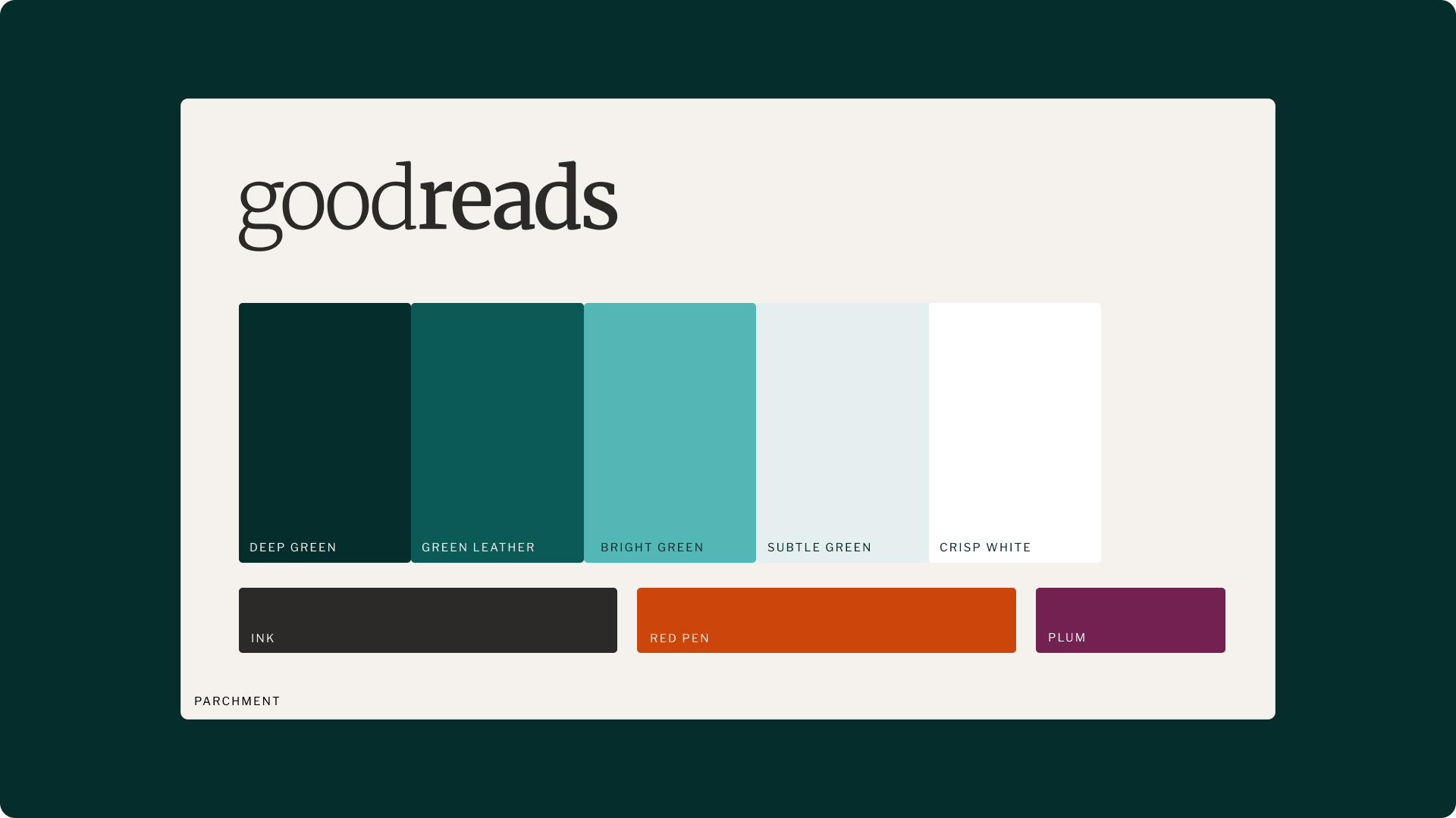
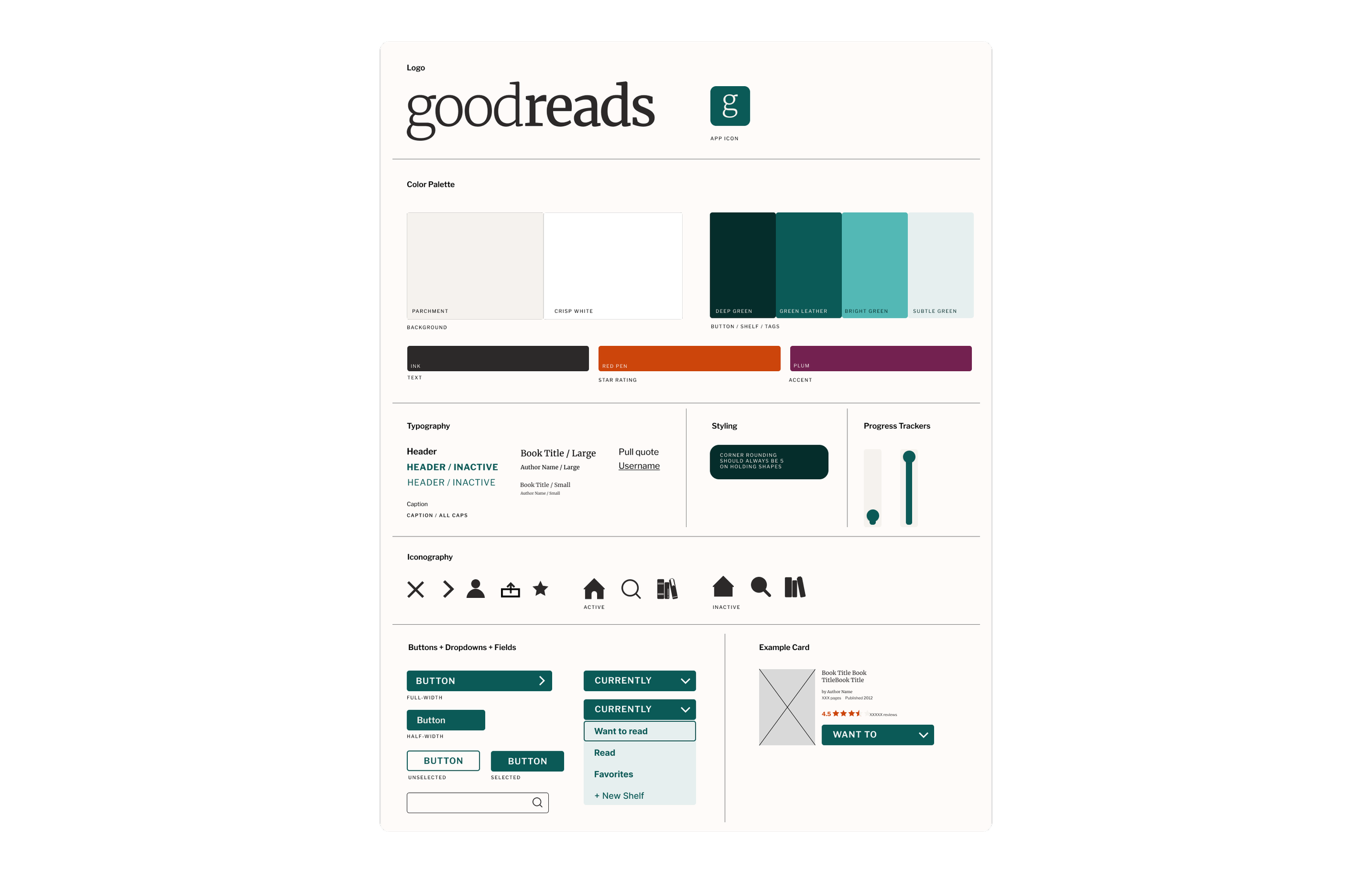
After reviewing the testing feedback, I made refinements to the wireframes and began developing the high-fidelity mock ups. I also explored improving interaction moments like how to switch between ‘shelves’ in exploring books and your library. I found a side-scroll sub-nav worked best. I also refined the existing GoodReads palette to be more accessible; the current app color palette included 15 different colors. I refined it to 5 colors, adding on tints of the brand green to increase options to meet contrast and legibility standards.
Branding
While working through the visual identity of the app, I explored the logo and app icon as well. Through iterations, I landed on a serif similar to the typeface used in the app experience that evokes typography found in books. I also applied the color palette of ink and leather green to balance the serif with a sense of modernity.
I created a sticker sheet as I moved forward to easily apply improvements from the app to the desktop browser setting.
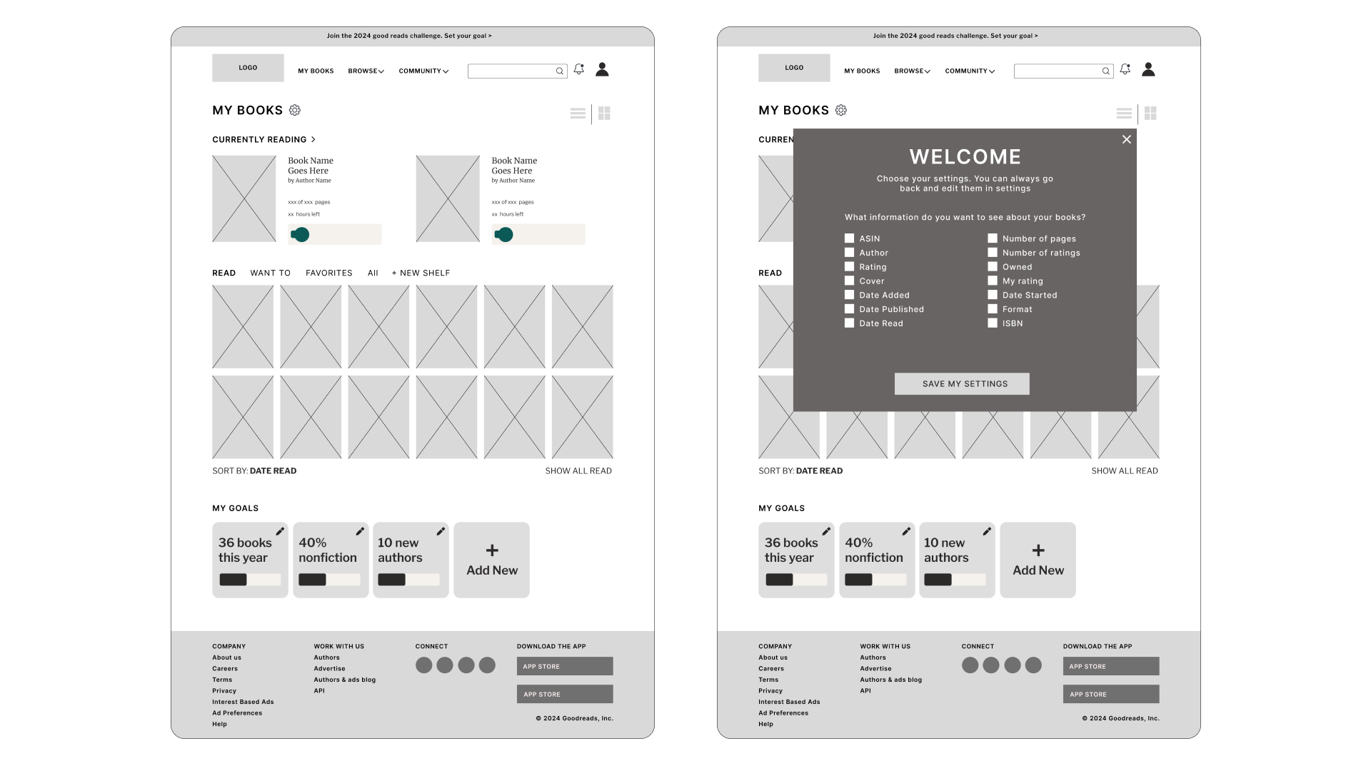
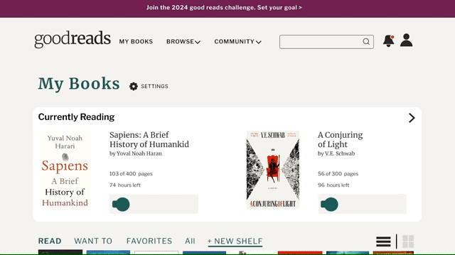
The Website
The existing GoodReads website is overwhelming with choices of where to navigate to. After reviewing the site architecture, I took on one page to exemplify how the simplicity of the app could translate to desktop and larger screen experiences.
I migrated many of the always visible options and menus in the current experience to a welcome screen and folded into the settings the ability to revisit in the future. Most are preferences that the user would set and forget.
Learnings & Future Improvements
An improvement I would recommend for functionality is improving the book cover and barcode scanning feature. The accuracy is more misses than accurate recommendations causing a user pain point.
I would also spend more time reviewing the site architecture to relieve decision fatigue for the user and streamline flows to focus on user goals.
This is a project I did for fun and to grow my skills in UI/UX and Figma.