
STOREFRONT OVERHAUL
BRIEF
The storefront was disorganized and inconsistent with the other brand touch points. The information architecture is confusing and could better align with marketing funnels and messaging. Overall, the copy and product differentiators have become watered down and do not clearly or concisely help the customer shop the right product for their need. The initial phase of the storefront overhaul focused on the storefront home page and pet products; a future phase would flesh out updates to the household cleaning products in more depth.
ANGRY ORANGE TEAM: Michael Parker Marketing Director, Louis Robert PPC Lead, Nicole Weber Brand Director, Britney Jackson Senior Copywriter
OLD STOREFRONT
MAIN CHALLENGES
Product Selection Confusion Customers were frequently purchasing Odor Eliminator when they actually needed a cleaner with an enzyme like the Stain Remover
Navigation Complexity Lack of clarity between different product use cases
Customer Education Need to better communicate product benefits and use cases
PROCESS
As a collaborative team effort, we audited the storefront and prioritized updates based on products struggling the most and urgently needed attention. I used the priorities and storefront audit to create initial wireframes detailing where information would land to align the team and hand off to our copywriter to assist in messaging exploration.
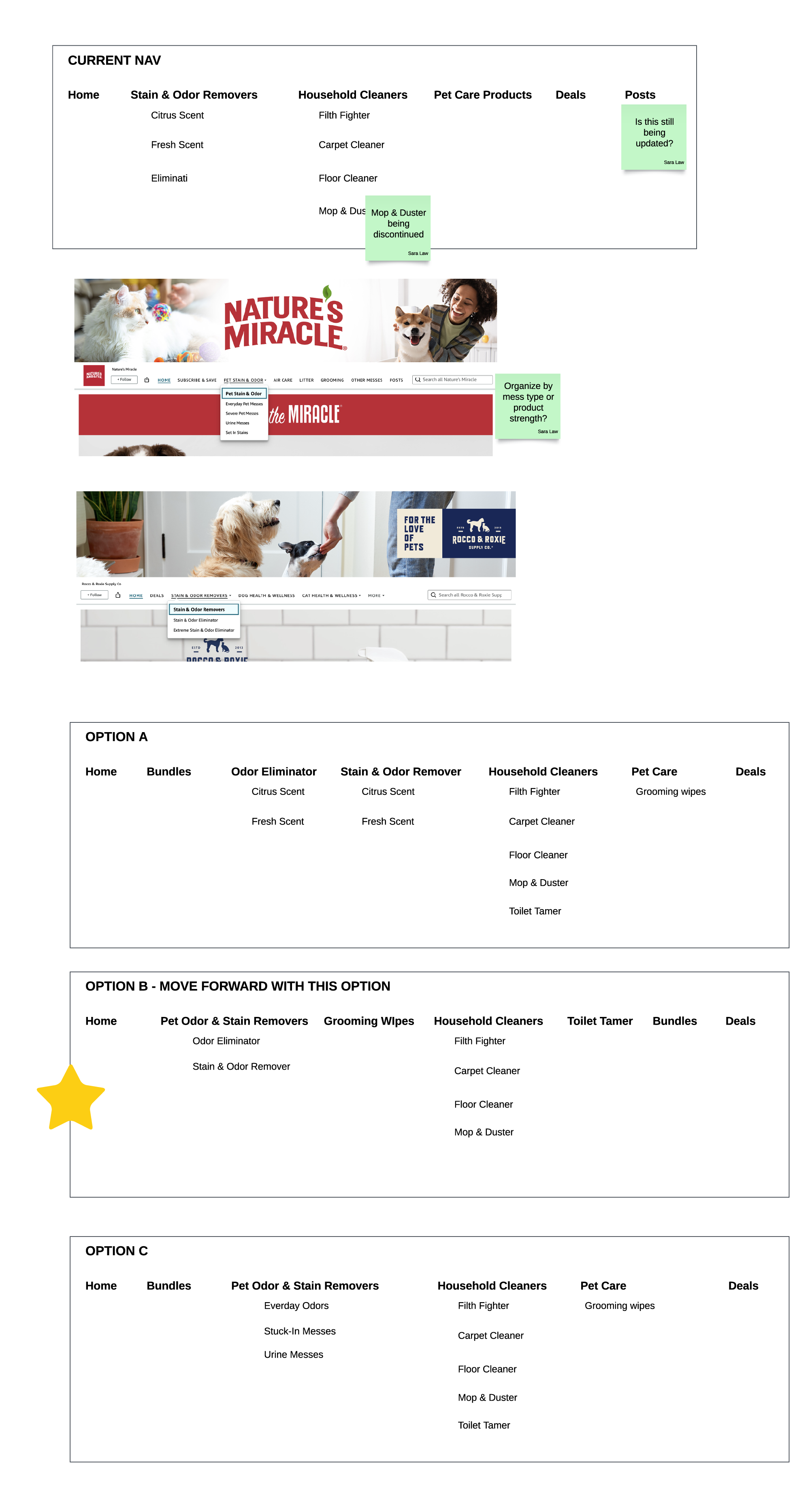
The team also aligned on an updated information architecture for the storefront to have a better funnel from ads onto landing pages within the storefront. An urgent need was to create individual pages for the Odor Eliminator vs the Stain Remover to better educate the customer. Currently, the products were organized by scent, but not use case which did not seem to resonate with all shoppers.
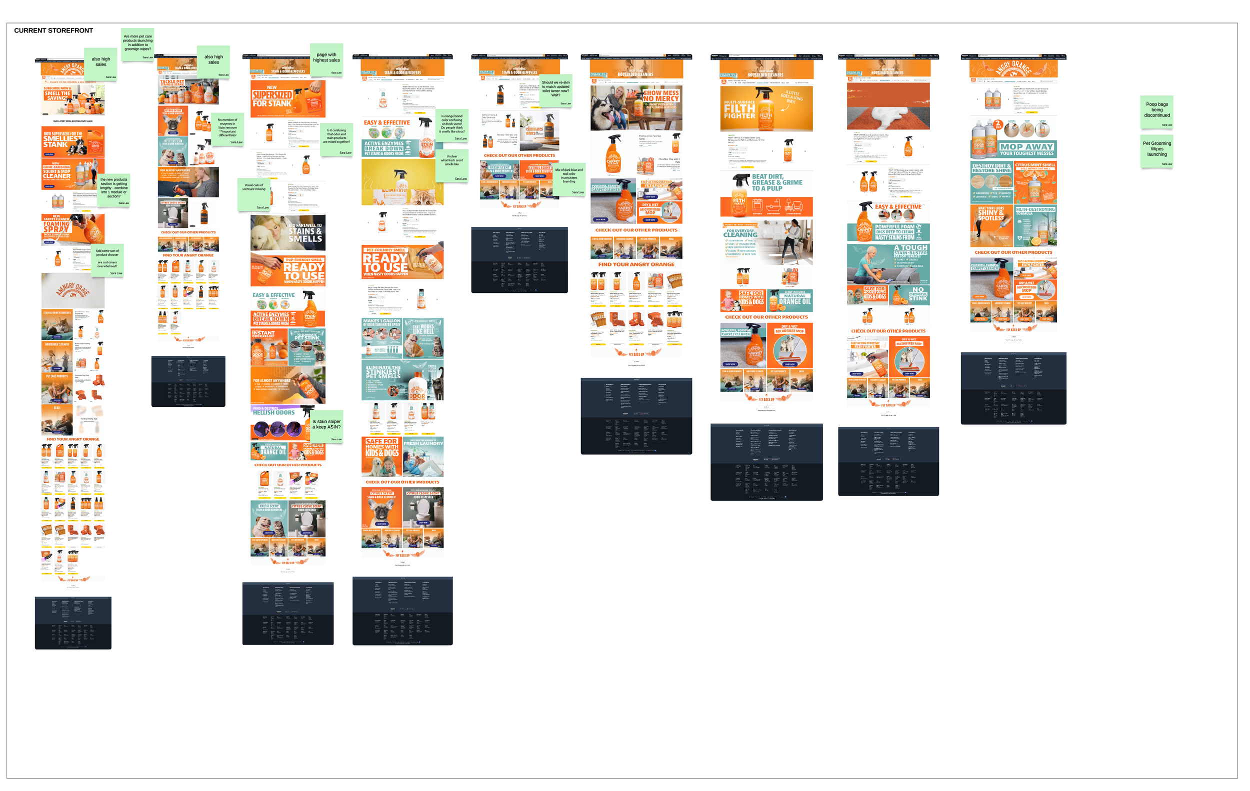
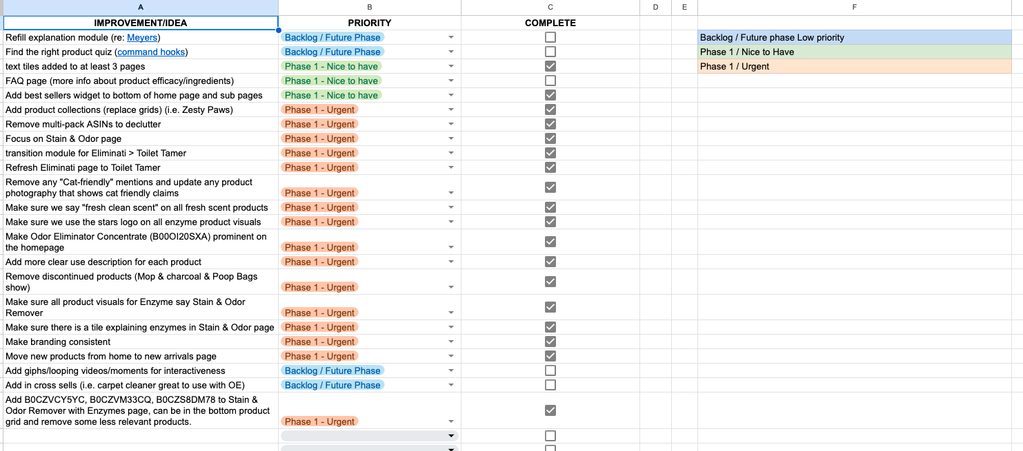
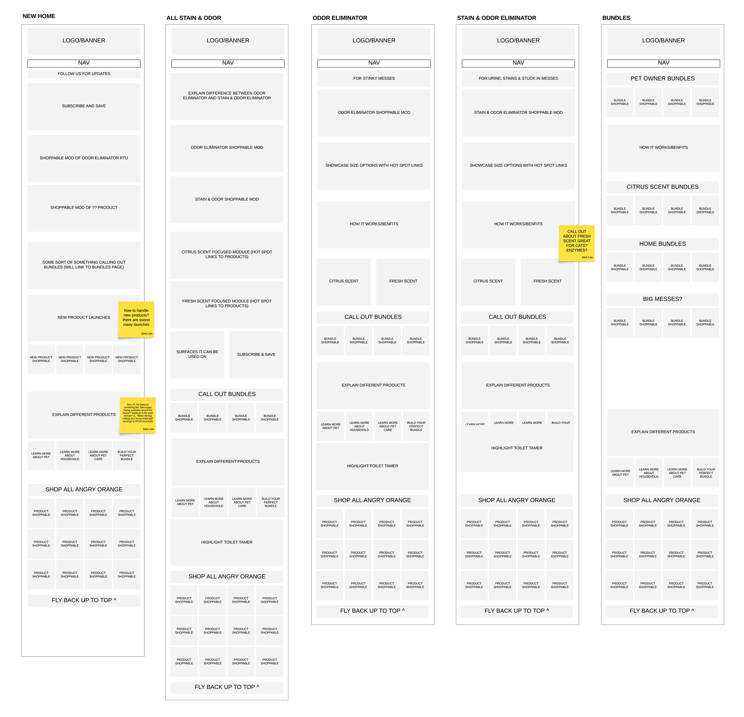
View audit and wireframes here
COMPETITORS
Two competitors that stood out in the research phase were Nature’s Miracle and Clorox from the cleaning product category:
NATURE’S MIRACLE / Direct Competitor
+ Clearly, concisely describes product above the fold
+ Follows a consistent page structure, customer does not have to hunt for information
+ Clear flow to show to shop the products: cat or dog? level of mess?
- product naming is confusing and unclear, unclear what makes products different
CLOROX / Indirect Competitor
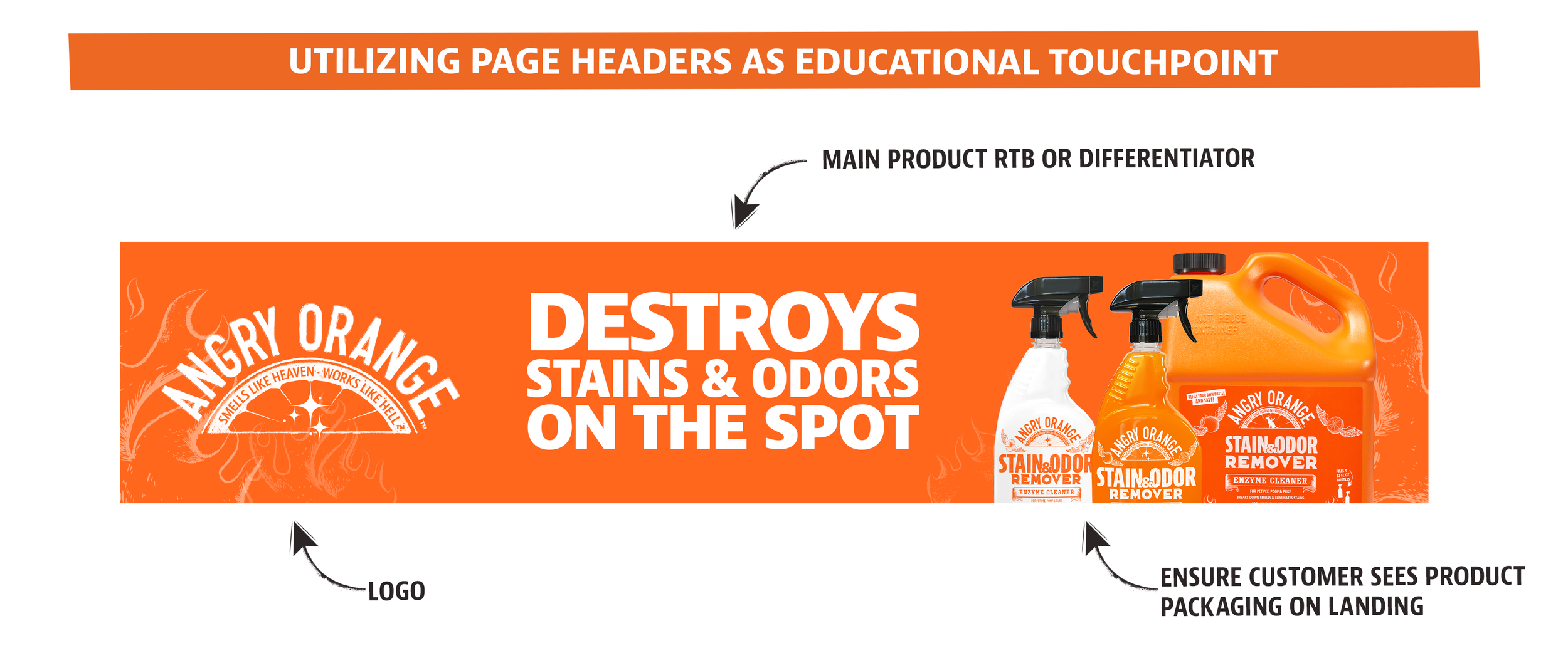
+ Utilizes page headers for use cases
+ Simple, direct copy
+ Minimal imagery before shoppable products
UPDATED STOREFRONT
CHECK OUT THE LIVE STOREFRONT HERE
IMPROVEMENTS
Dedicated pages for each product line to better tell the story of when an odor eliminator vs a stain remover is needed
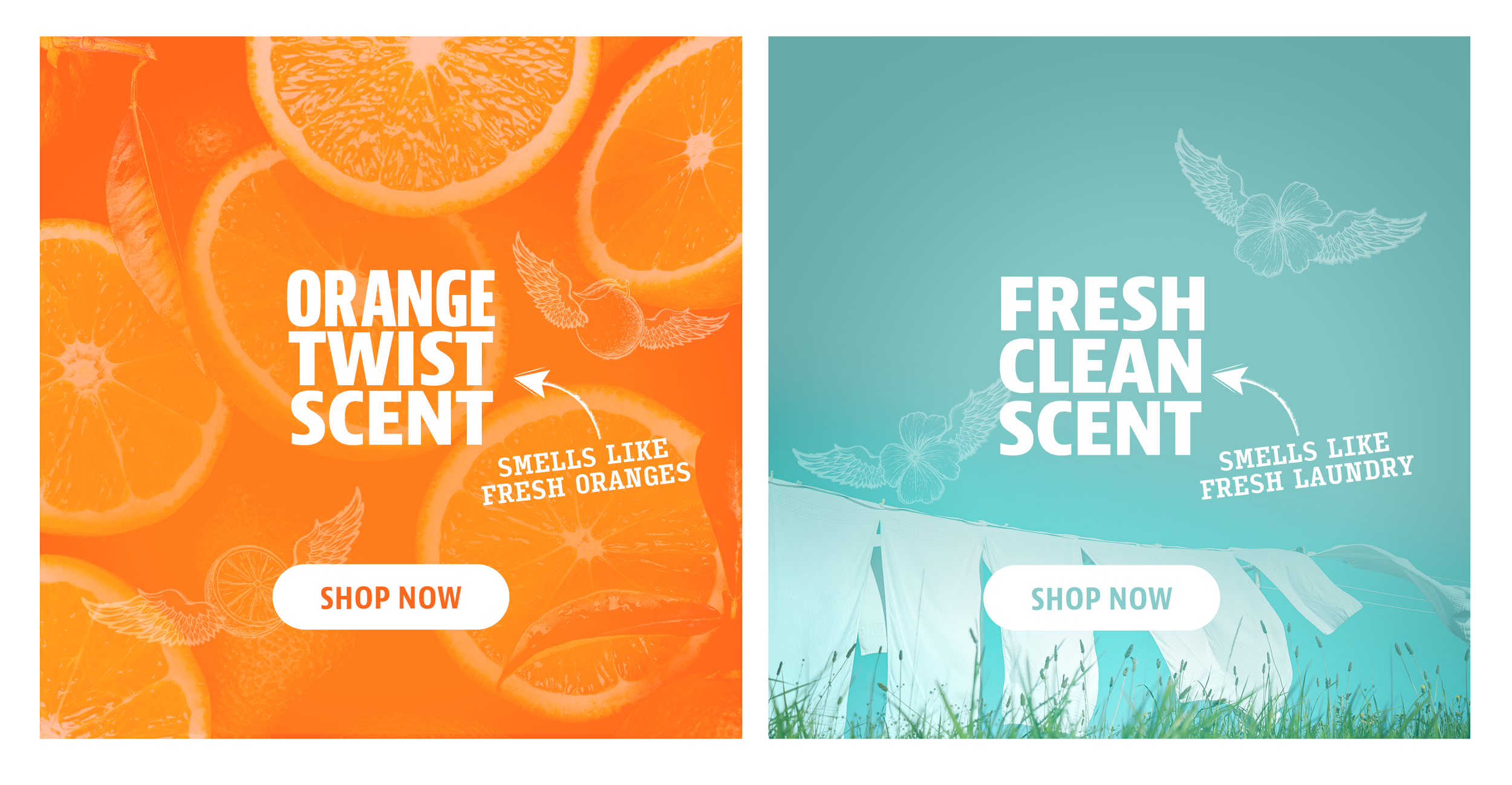
Visually highlighted scents
Simplified messaging making it easier for the customer to identify which product meets their need
Added a simplified product quiz on the home page so that the consumer can compare the product lines in one place

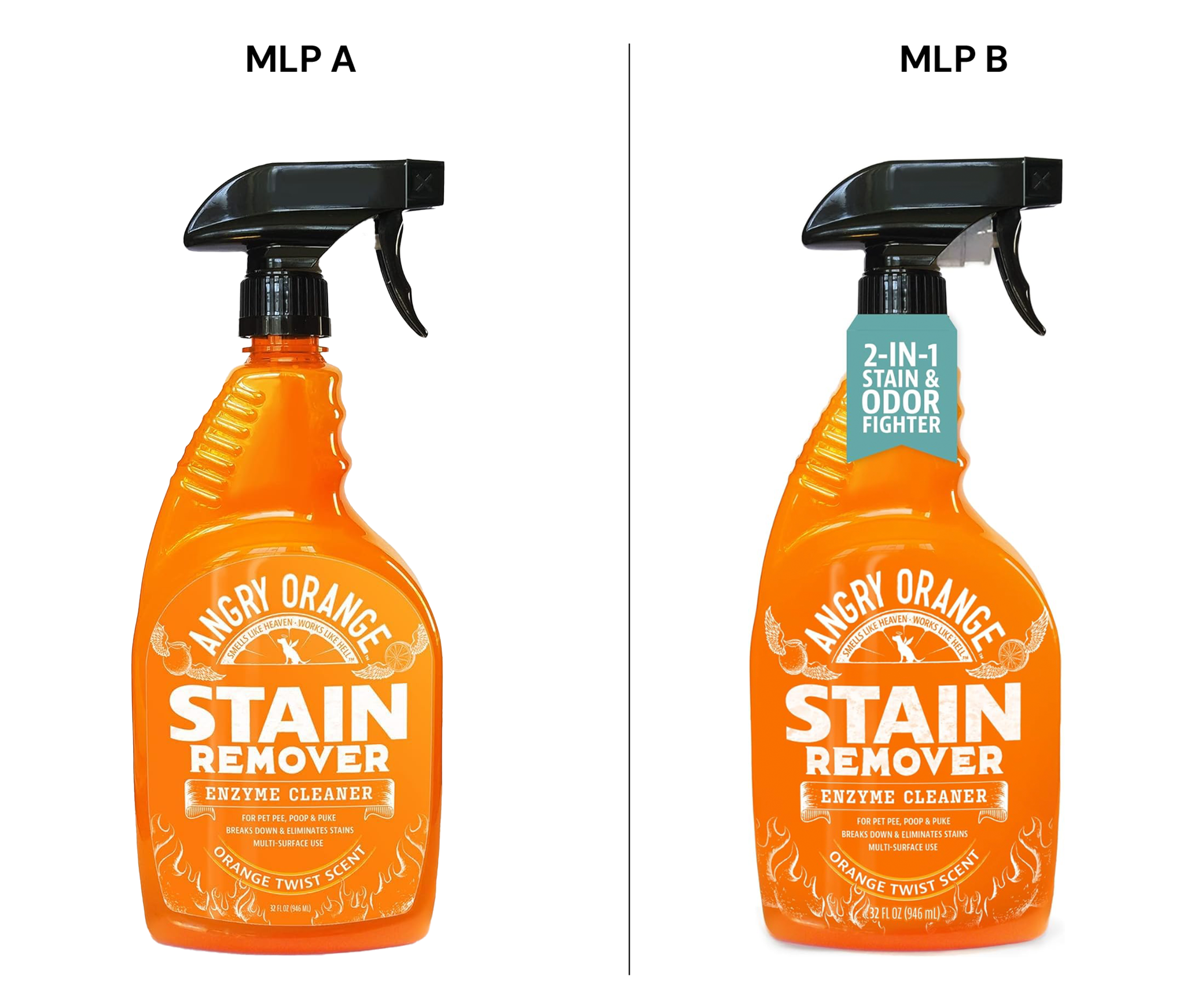
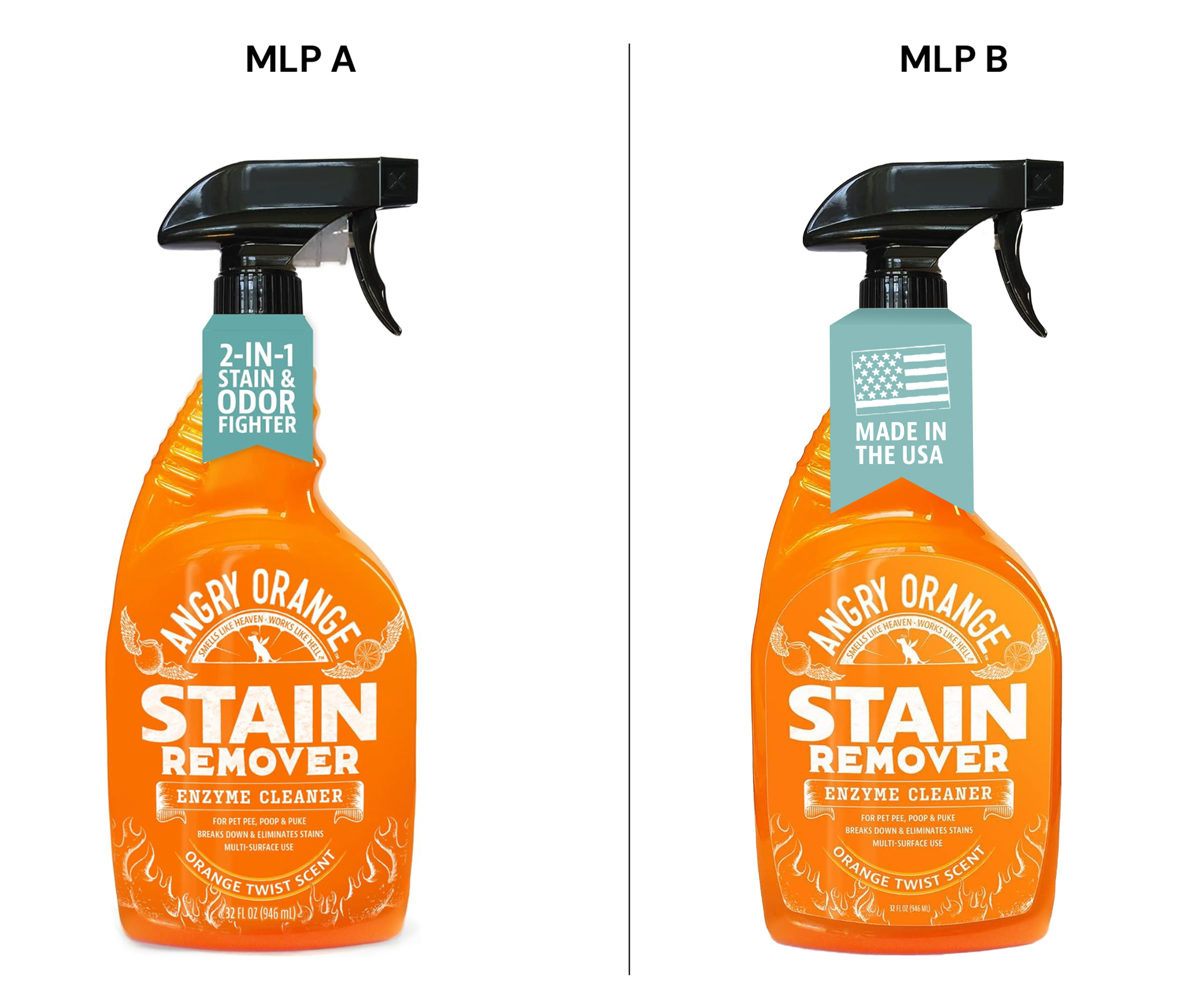
MAIN LISTING PHOTO TESTS
Our goal was to test messaging for each product to better understand what resonated with customers and aided in their purchase decision. To minimize variables, I utilized a hangtag on the bottle as a holder for the messaging.
TEST 1
Value-centric messaging
TEST 2
Transparency focus
TEST 3
Results/impact
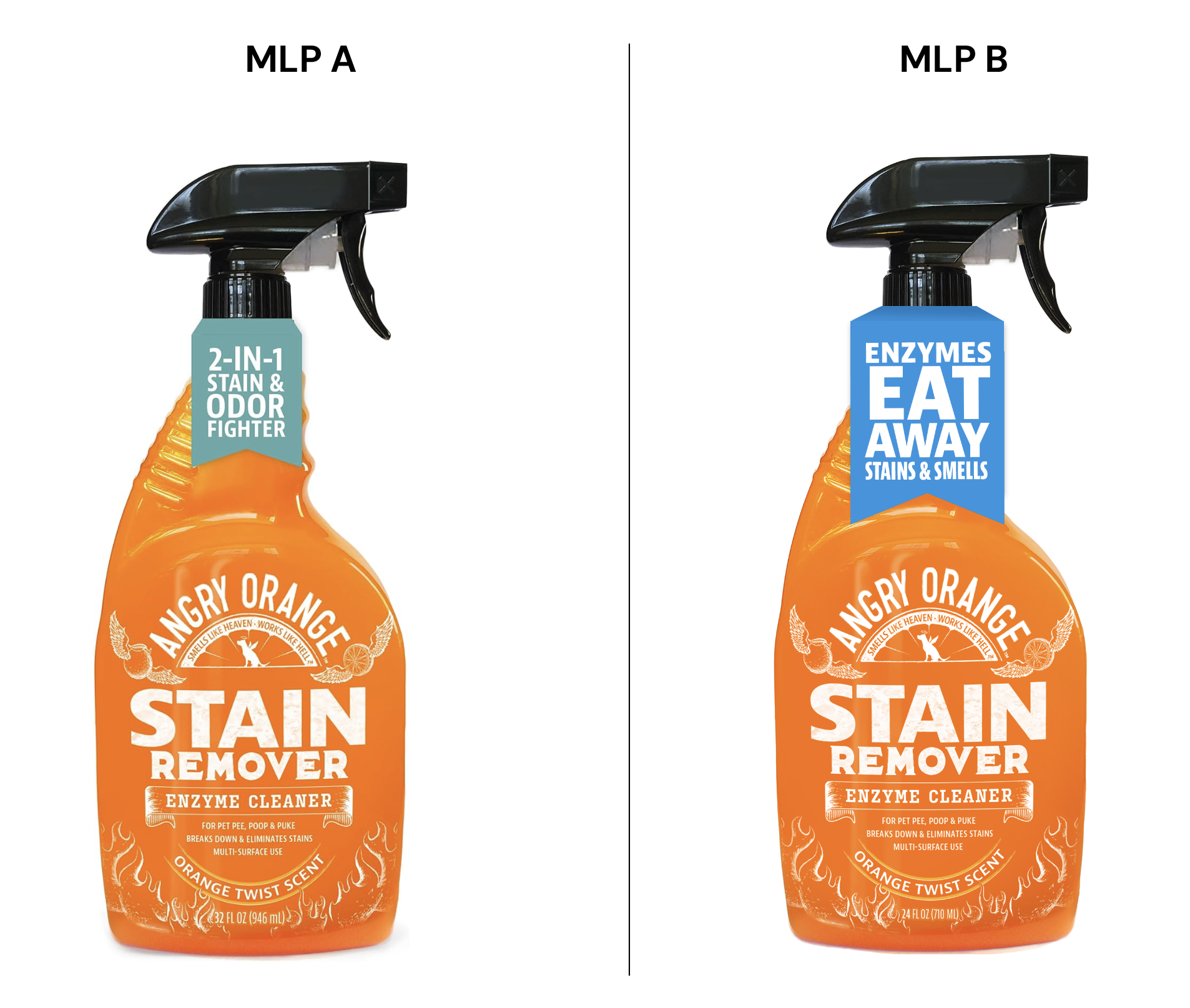
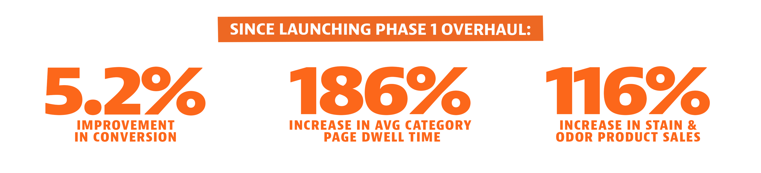
The final test utilizing “Enzymes eat away stains & odors” resonated with customers and had statistical significance.
Louis saw an impact on the PPC data showing - spend per week has increased per week, while ACOS has remained flat which is a good sign and appeared to be driven by a spike in CTR caused by the MLP A/B test. Because of the significance of the test, the team plans to roll out the language throughout the customer funnel to maintain traction and aid the consumer shopping experience.
