
About
The idea for Choosie came from a place of hanger and indecisiveness among friends. We were wishing there was a way, kind of like this or that to narrow down and help us decide where to eat when there are so many great options. Almost like a dating app for food. We wanted a product that could be filtered based on things we for sure did not want.
Process
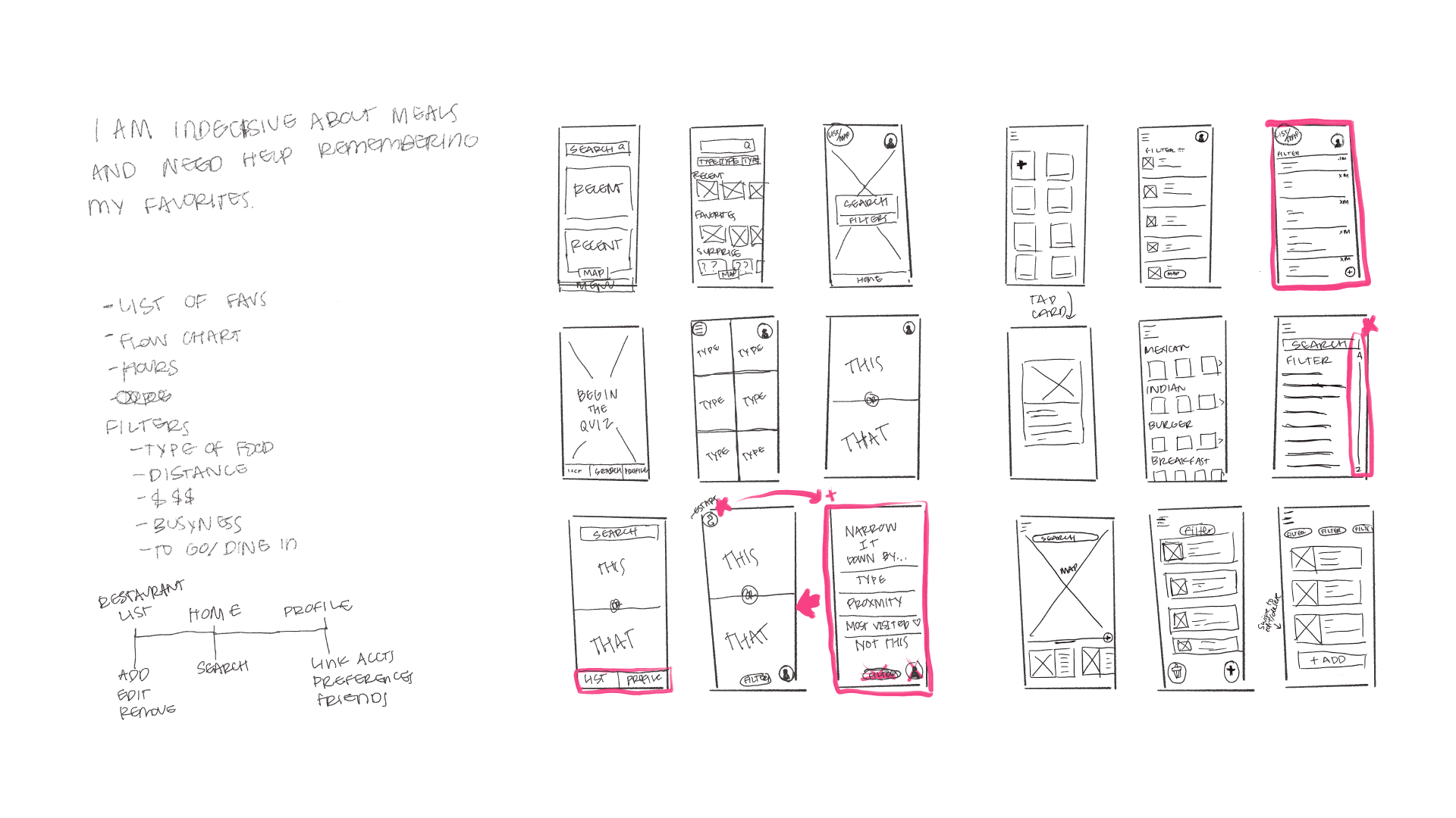
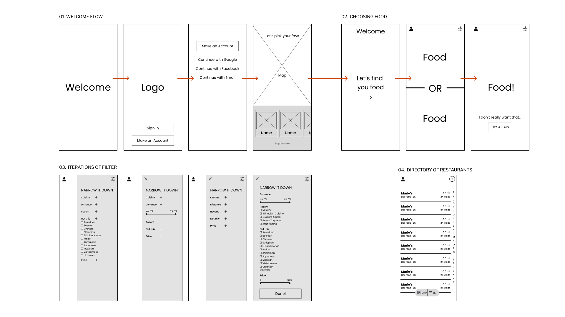
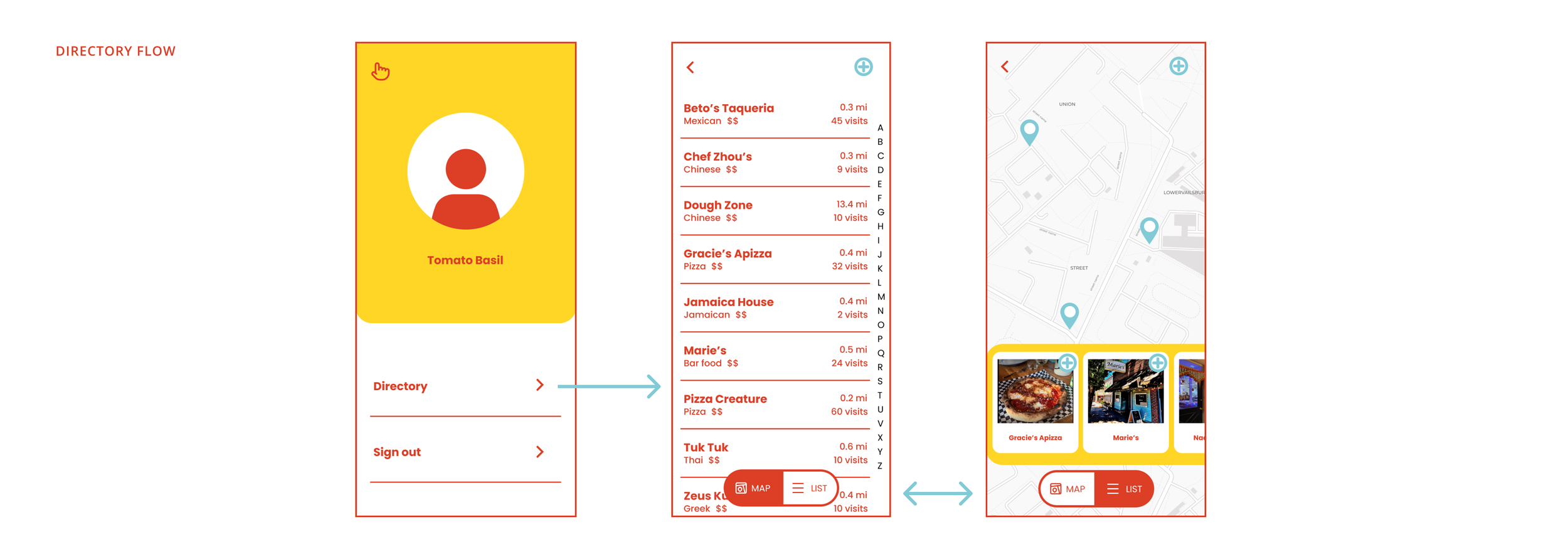
I began by sketching and writing out pieces that would be important to the flow and filtering. After identifying key pages and pieces through paper sketching, I moved to low-fi wireframes to prototype and iterate. This piece of the process helped me refine what filters should be included.
Branding + Design
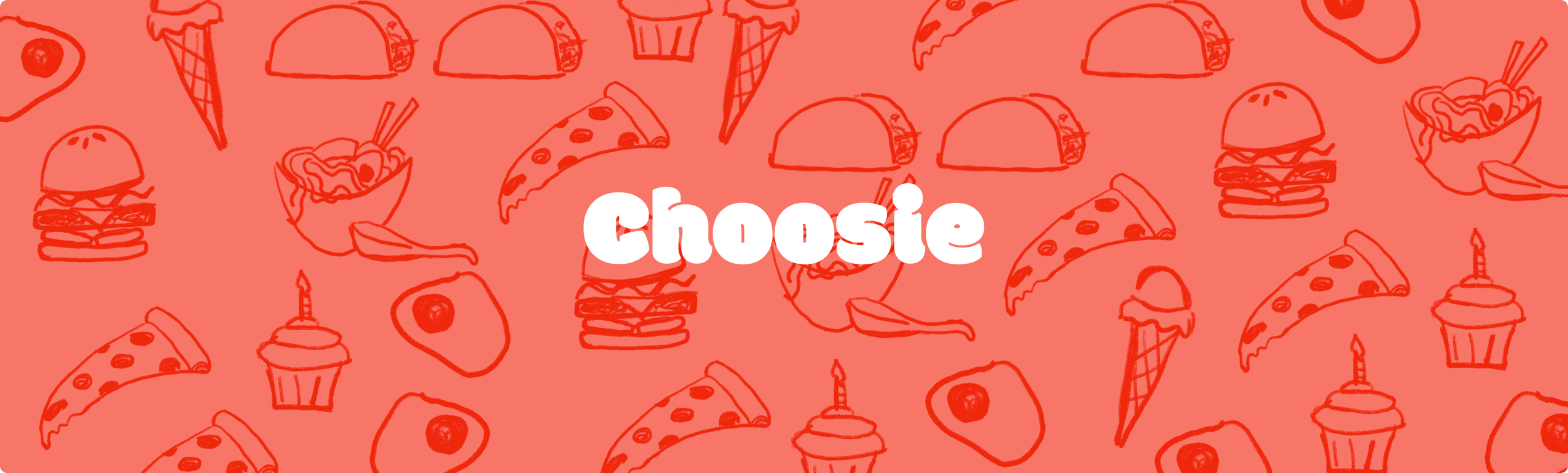
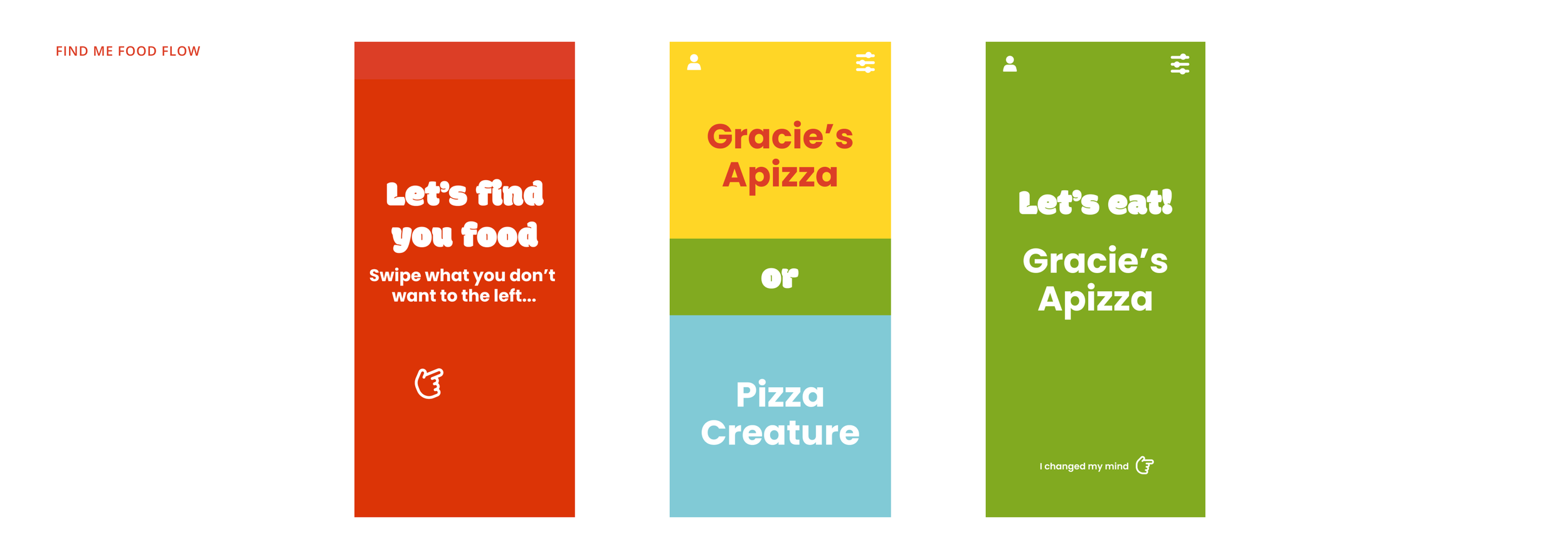
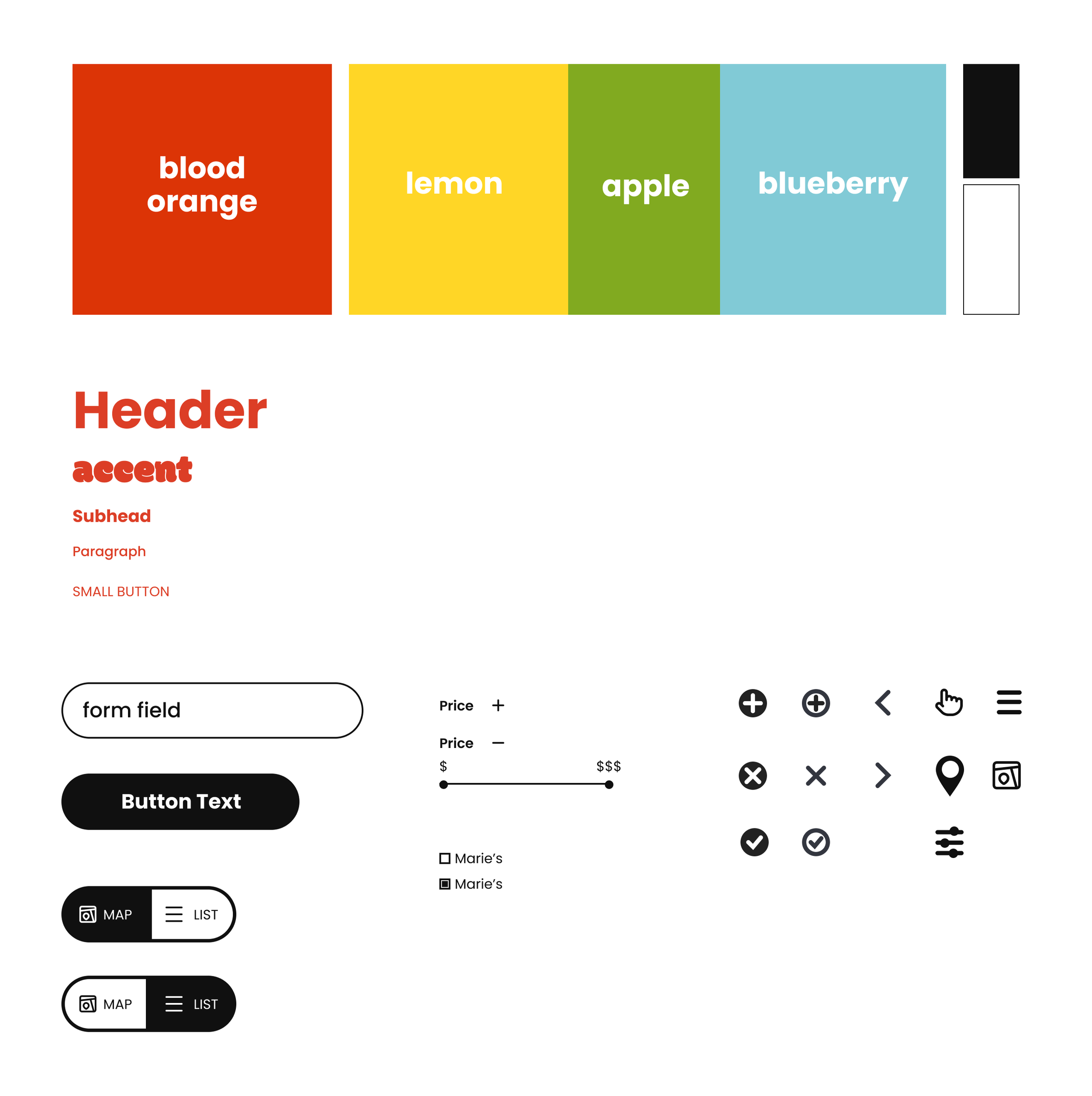
With the branding, I chose vibrant colors associated with appetite and eating. I explored the overlapping of colors to represent the sense of indecision ending with solid color blocks to signify the final choice. Outside of color palette, I chose for the iconography and typography to be clean and simple to make it low-effort to use at the most hangry moments.

Learnings
While working on Choosie, I challenged myself to explore new interactions and transitions that would enhance the experience. I was also humbled by the end of the process; I initially thought designing a simple app would be simple but soon realized how tricky it is to create an intuitive experience where less is more. It challenged me to explore existing UX patterns and what simple apps I love are doing well.