The Scope
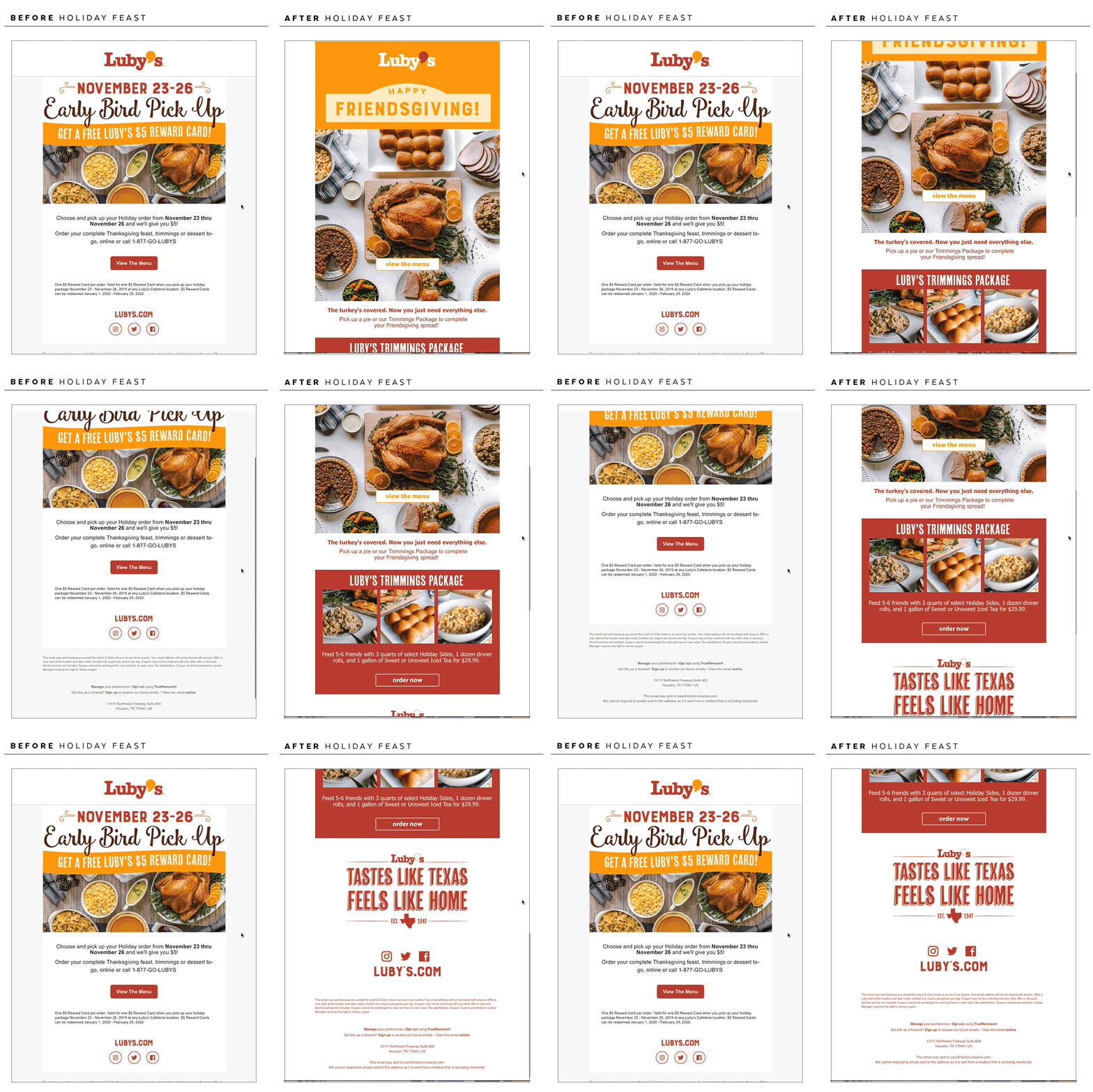
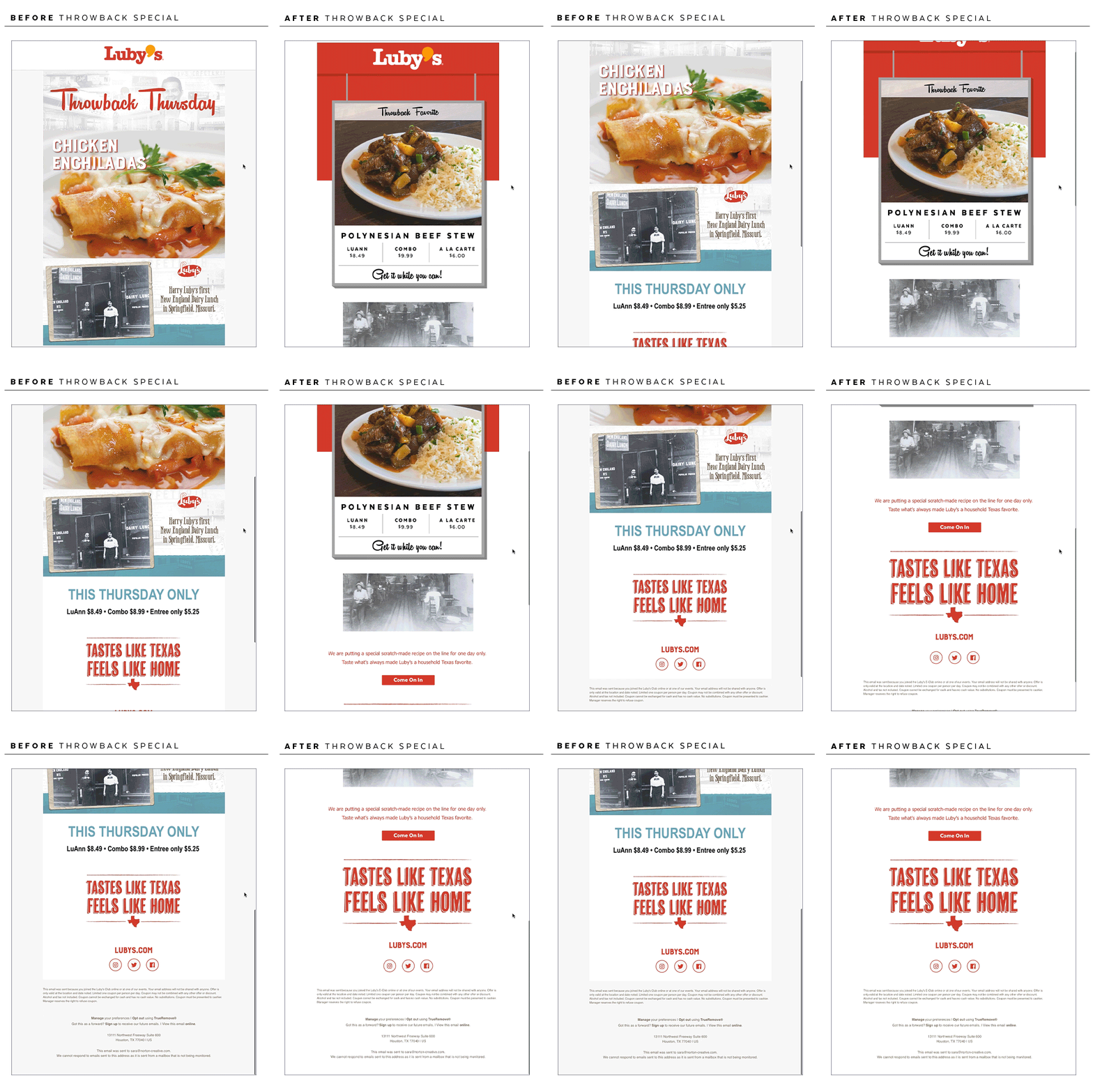
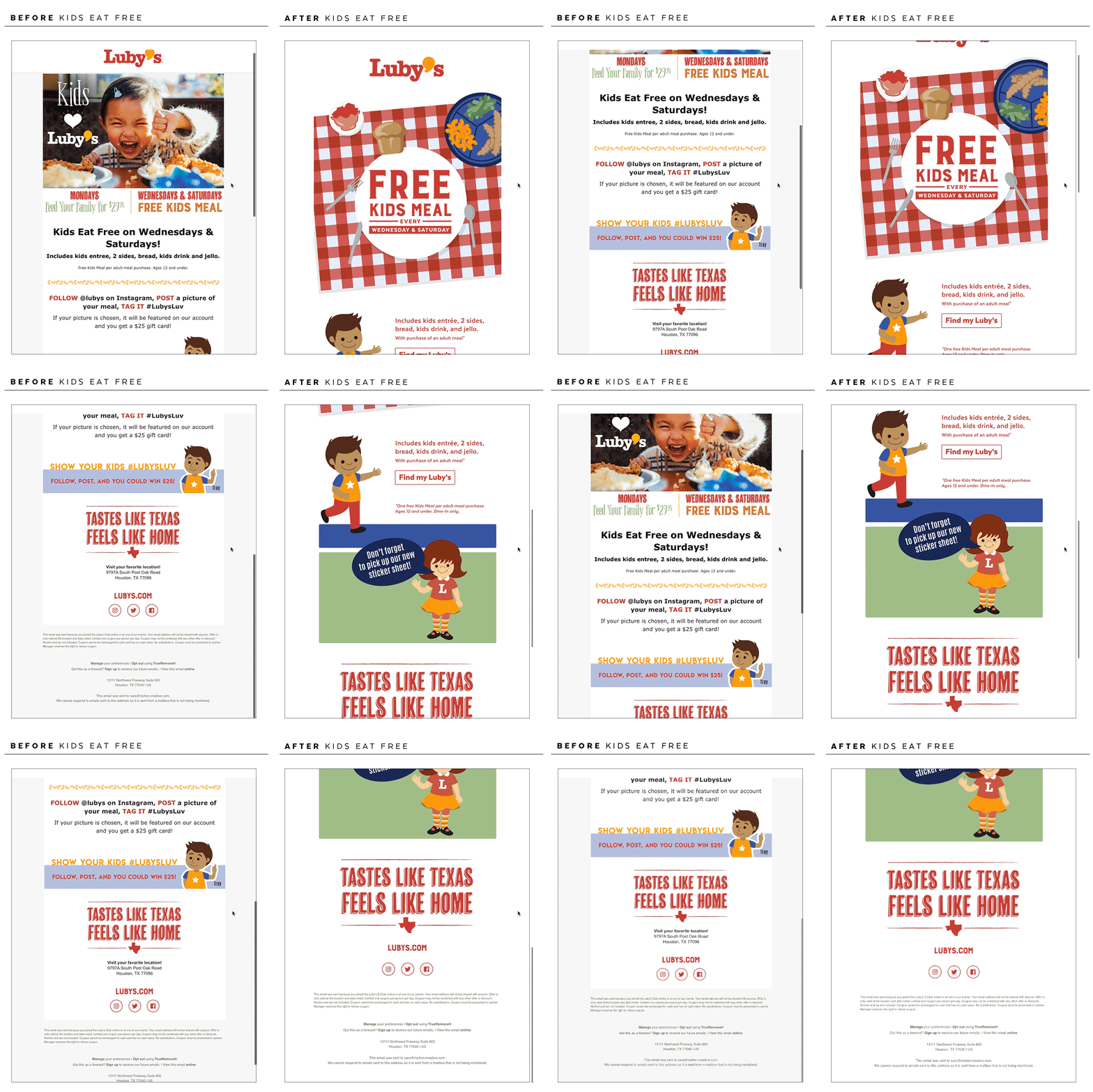
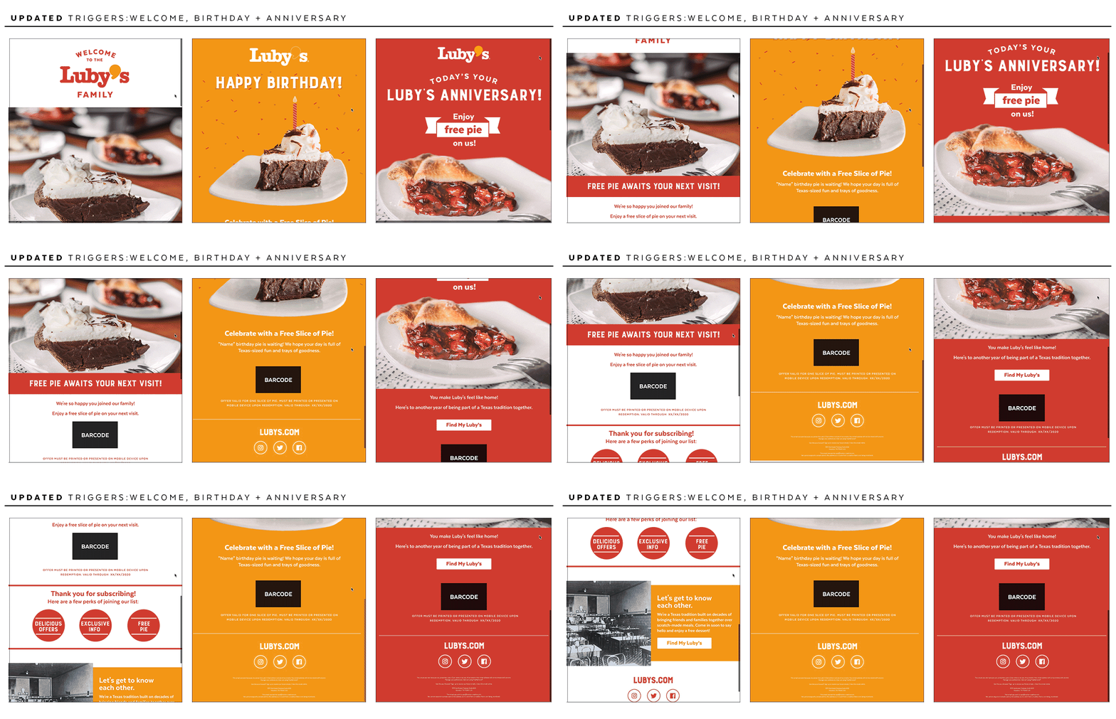
Luby’s selected Norton to maintain the social channels for the brand as well as revamping the email program. Our team evaluated and created a strategy for increasing social engagement while keeping the well-loved nostalgia of Luby’s front and center
Social Platforms
STRATEGY
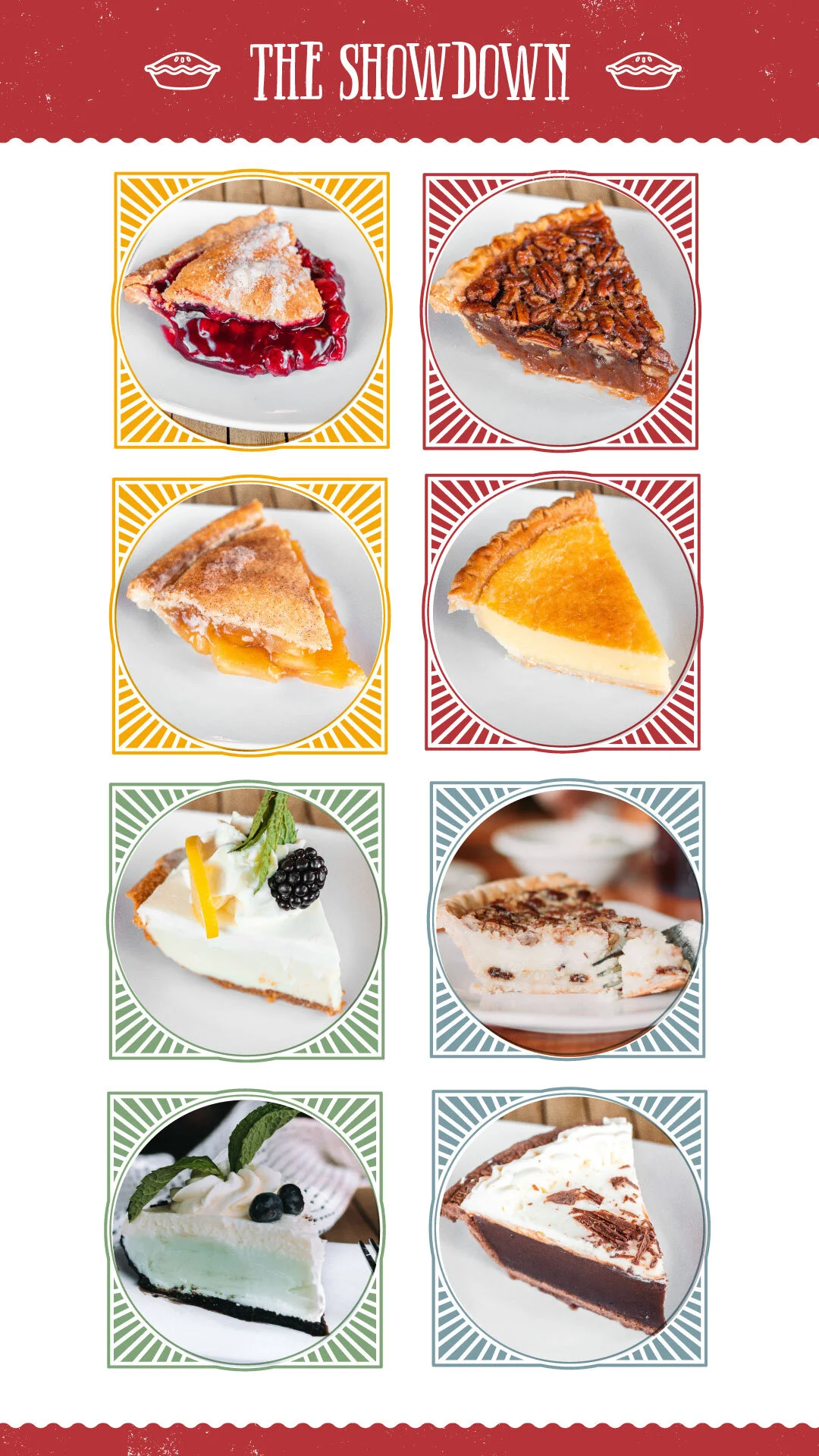
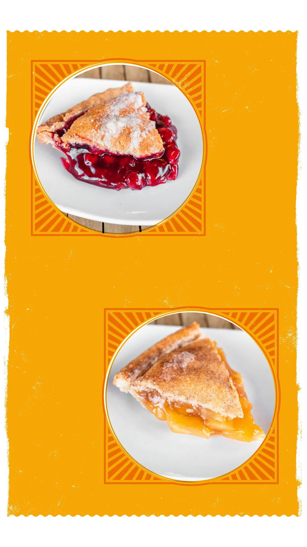
When our team took on Luby’s social platforms, we evaluated the current feeds to see what was working and what could be improved on. After reviewing it, we created a strategy for each platform to best fit each audience. To accompany the strategy, I created the visual standards to create a consistent visual identity and recognizable photography style to increase brand recognition.
LEARNINGS
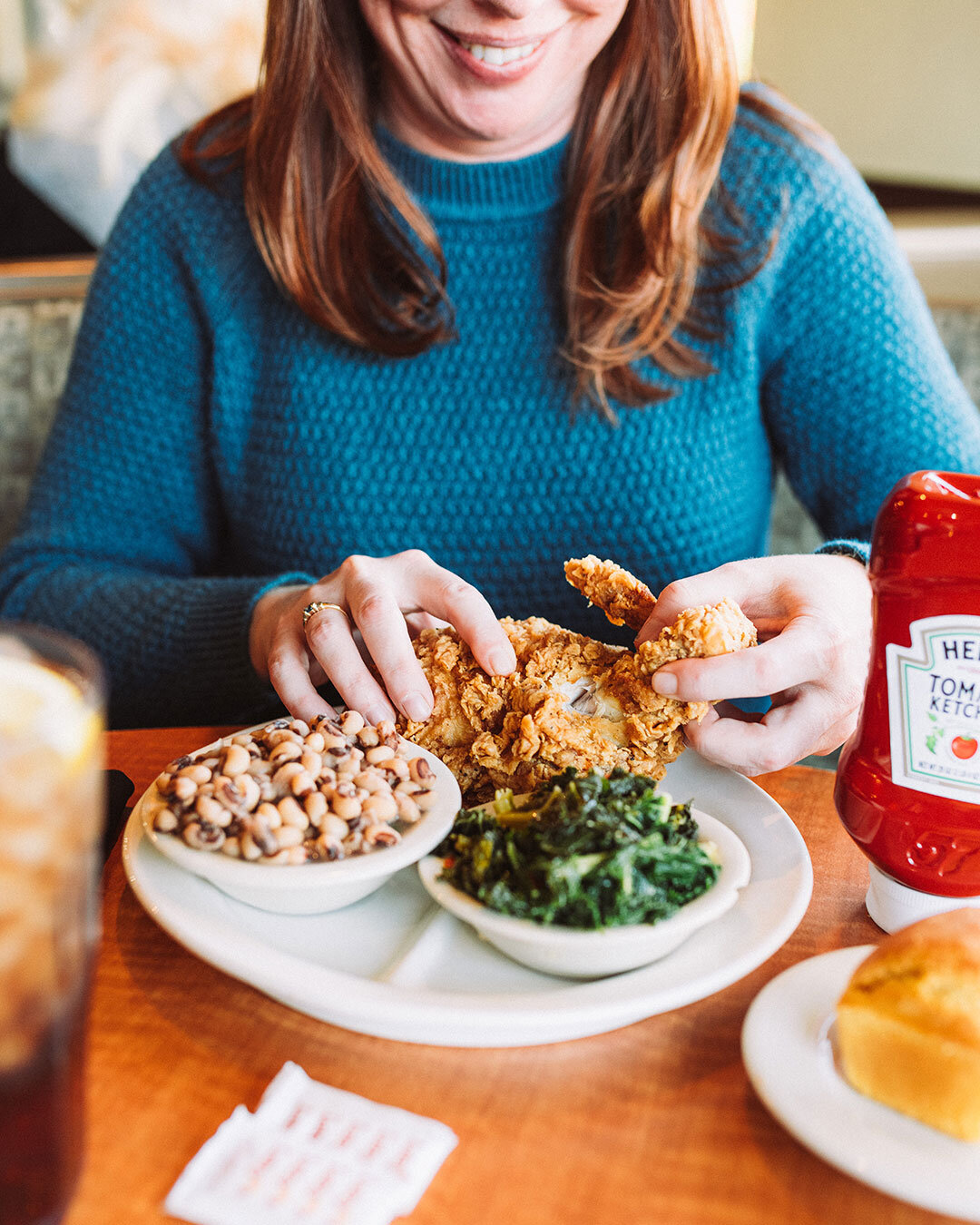
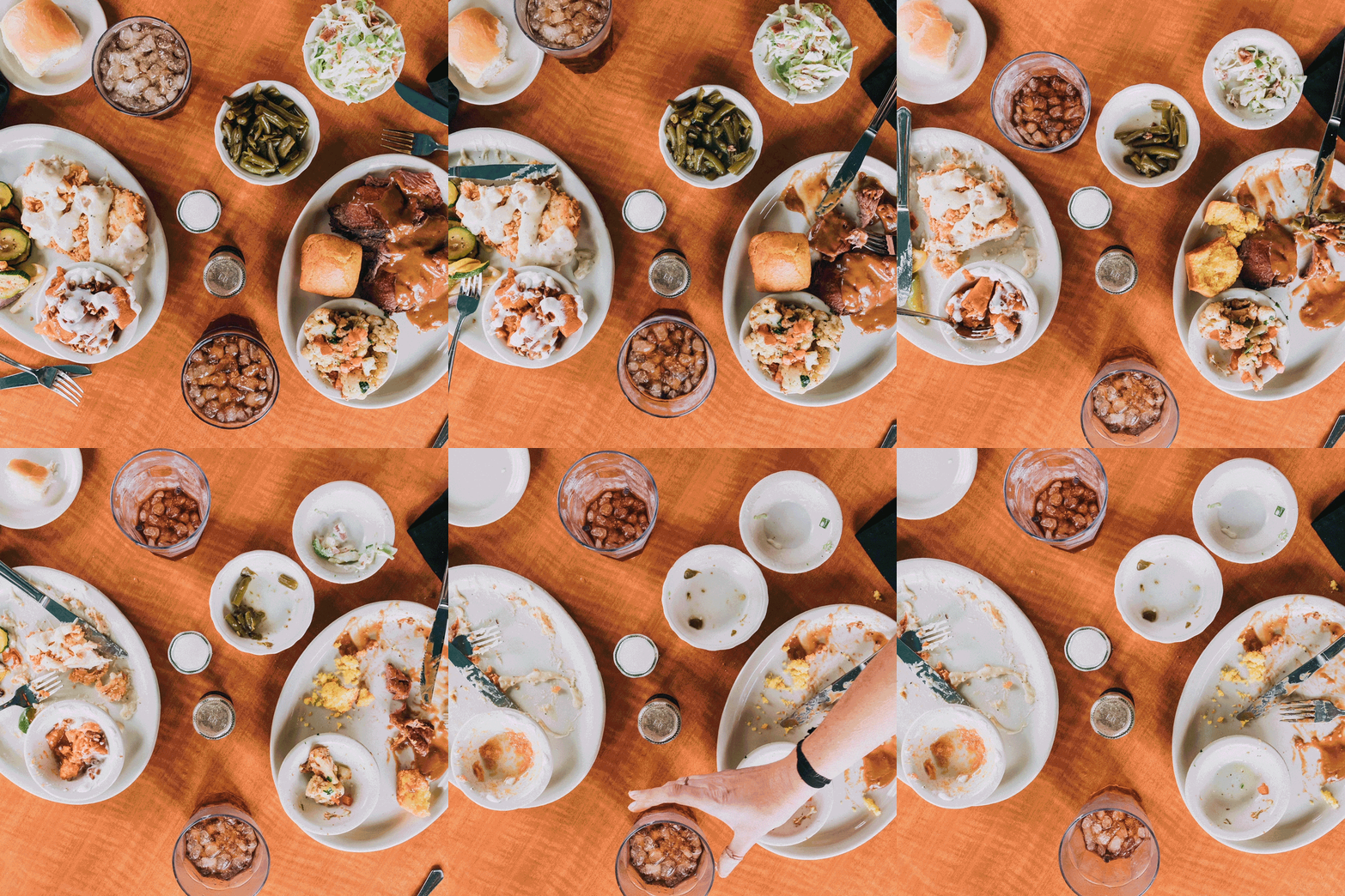
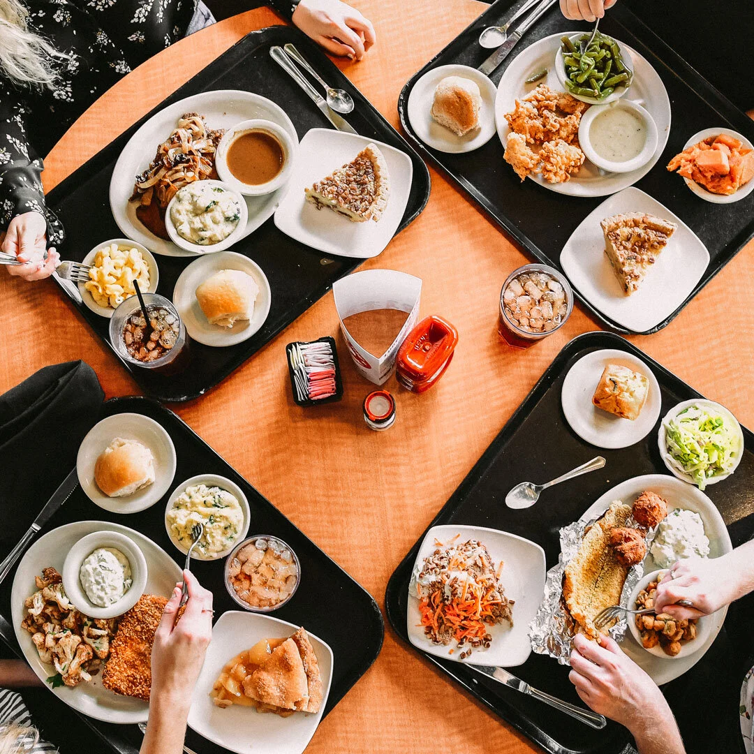
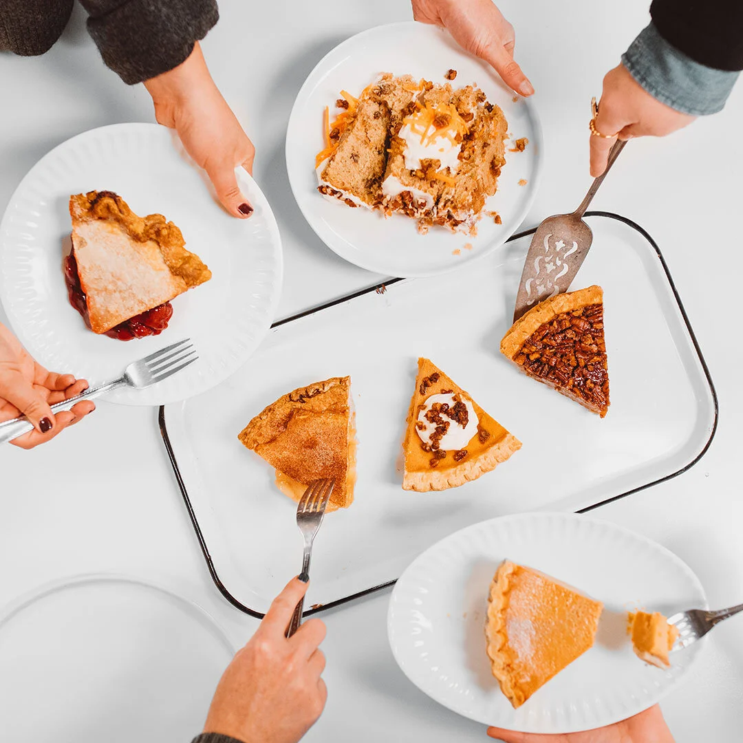
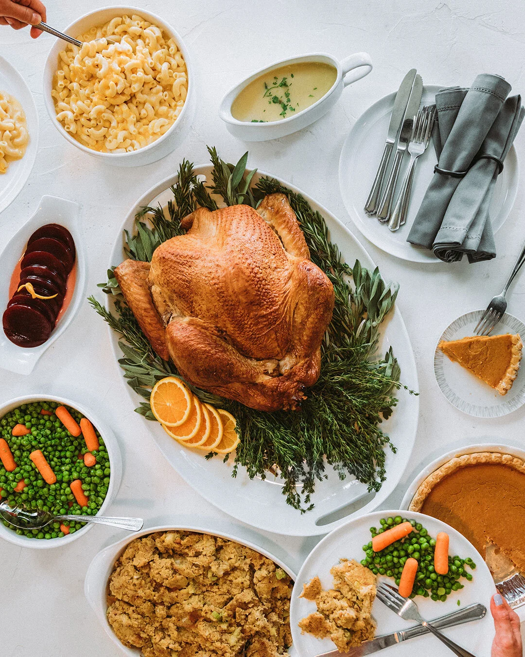
In the beginning we gave equal focus to the food options in the line, but the Luby’s staples like fried okra, mac n cheese and square fish continued to be top performing posts while vegetable and healthy options consistently did not receive engagement. From there, we adjusted the types of content and visual photography styles with high engagement. Both the tasty-style recipe videos (LuAnn’s Recipe Box shown below) and overhead or tray-forward photography resonated with the audience.
Successful Campaign
LuAnn’s Recipe Box features tasty-style recipe videos based off of real Luby’s recipes; it visually tells the brand story of genuine home cooking.
CAMPAIGN GOAL
A struggle has been engaging the audience to post videos and photos once they make the recipe at home. We hope to increase the incentive to post their finished recipes through giveaways and involving influencers in the future.
PIECES
Tasty-style cooking video Because we want to engage the audience to cook the recipes and repost their meals, the art direction fo the videos is friendly, genuine and spills aren’t edited out.
Recipe cards so that fans can get cookin’ on their own
OUTCOMES
This video series was some of the top performing content and engaged with Luby’s audience. Our team considered it a success and gained learnings of the type of content the channel’s audience’s wanted to see more of.

